Elevating the Digital
Experience for Fast&Up
Client — Fast&Up
Research, Strategy, User Experience
2025
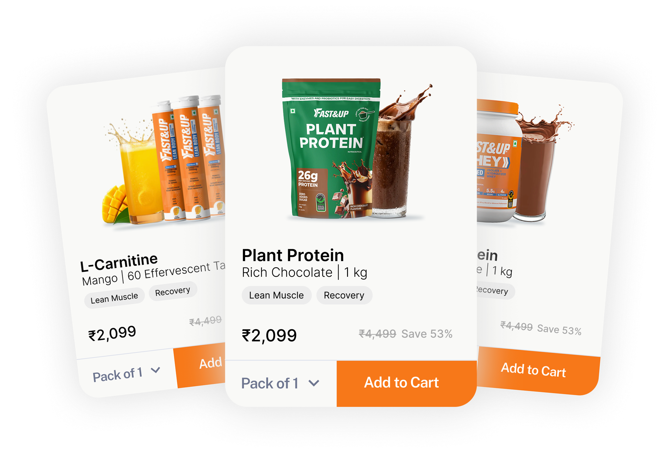
We collaborated with Fast & Up to elevate their digital experience to seamlessly blend performance with purpose — balancing functionality, clarity, and the Fast&Up brand ethos.
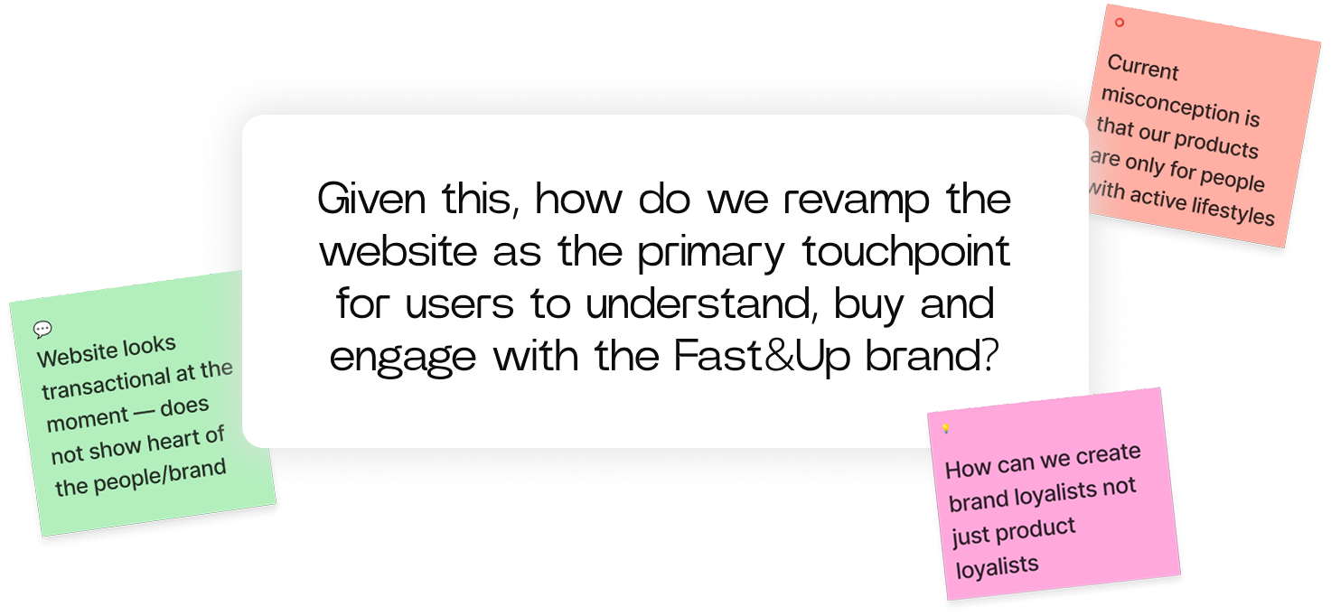
Our goal was to revamp the website as the primary touchpoint for users to understand, buy and engage with the Fast&Up brand. We wanted to create a relevant strategy to shift the brand narrative from an athlete focused performance brand to a lifestyle one catering to people with both active and non active lifestyles.
For a generation dependent on quick commerce we wanted to create an information rich space for users to peruse through and make important and researched choices concerning their wellbeing needs
We rebuilt the information architecture of the landing and product screens, with a mobile-first approach and responsive layouts —
Research Methodologies
I —
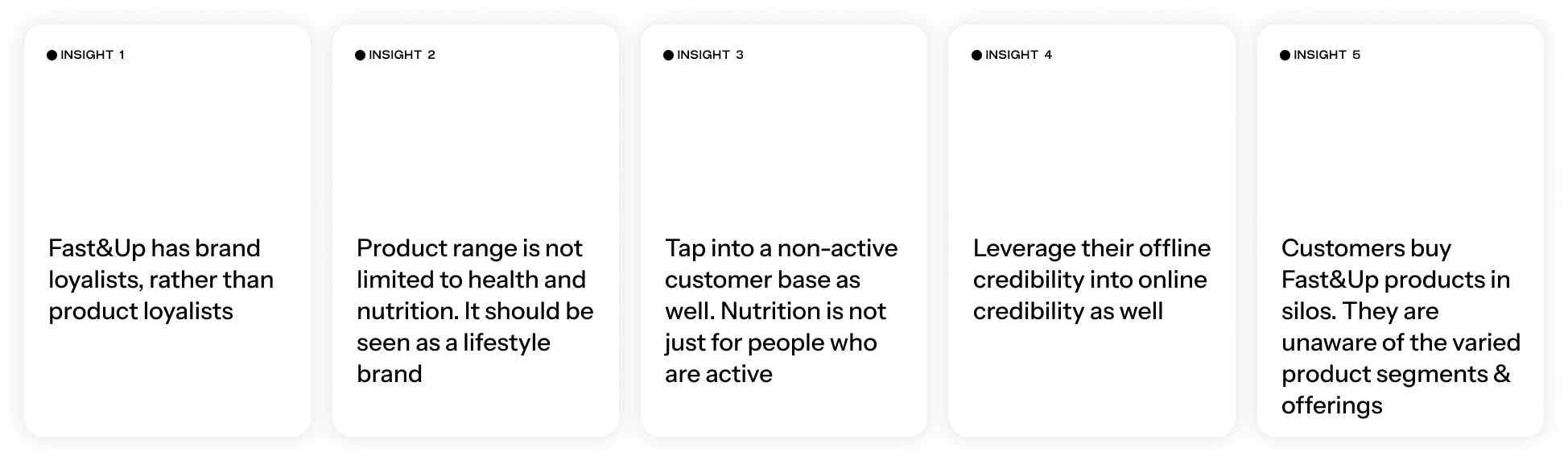
We interviewed 10 stakeholders across multiple departments to gain a comprehensive understanding of the brand and its key challenges.
II —
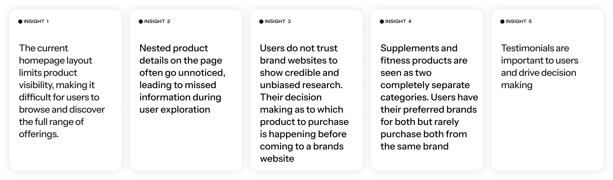
We conducted a survey with Fast&Up’s customer base and ran usability tests on the current site with 7 participants, with varying degrees of familiarity with the nutrition and supplement space.
III —
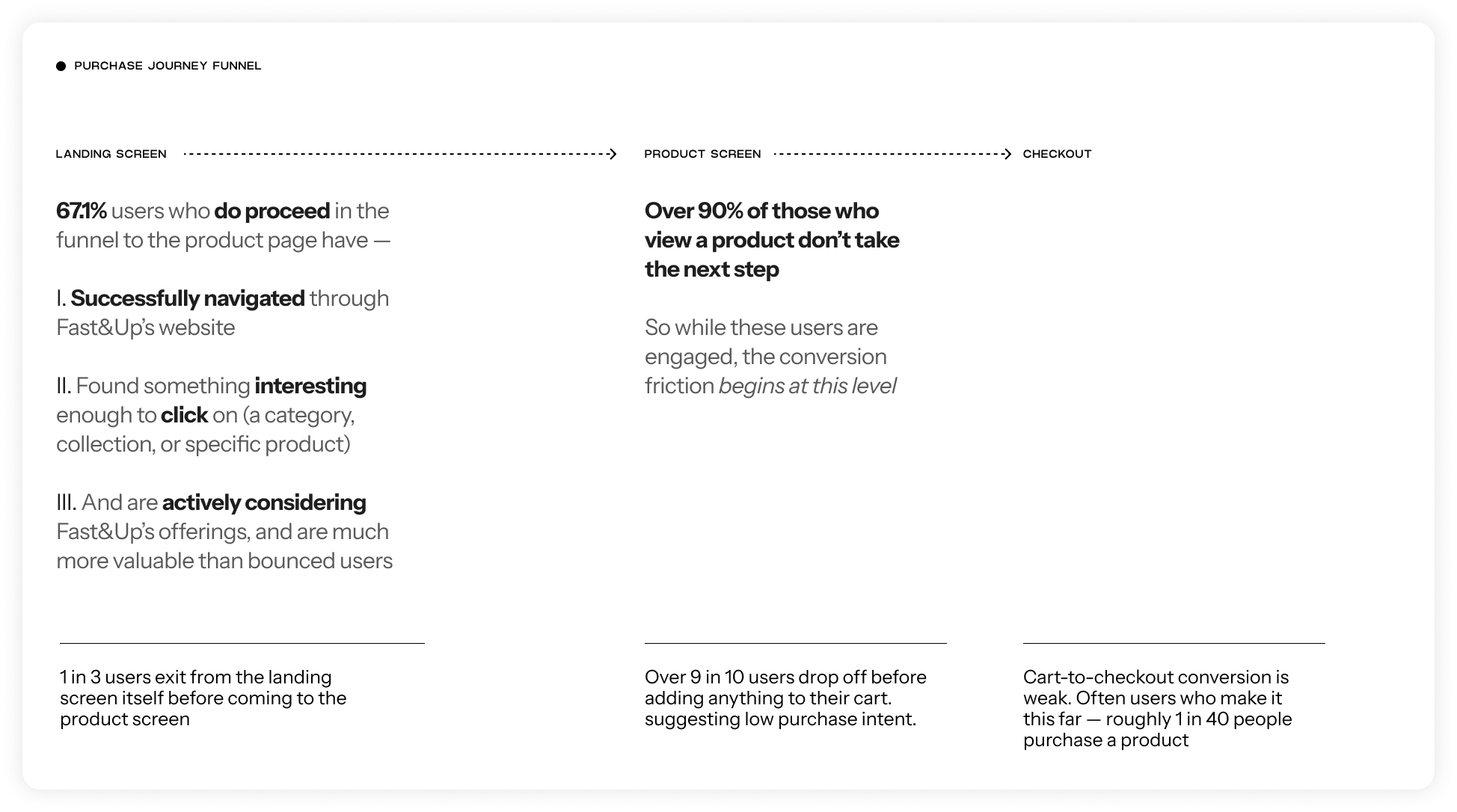
We analysed the website performance via data available from google analytics to find relevant insights into drop off rates, product performance, demographic habits.
IV —
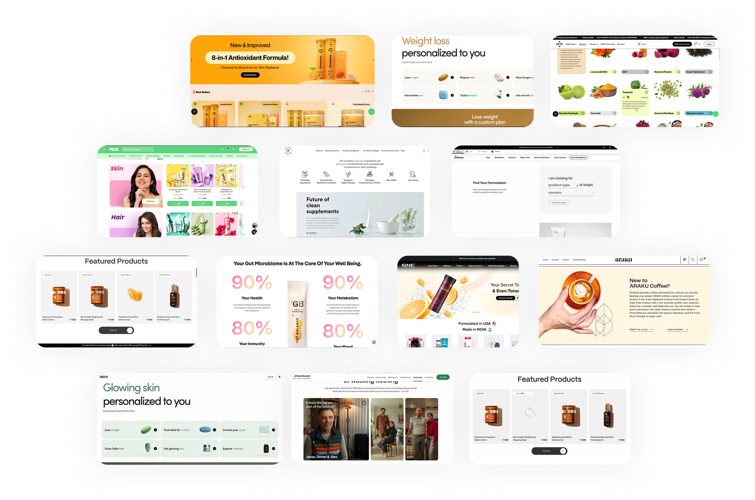
Analysed over 50+ competitors and brands both within the nutrition space and beyond,
to understand their digital presence, brand tonality and language, and navigation.
While Fast&Up positions itself as a lifestyle-focused nutrition brand, this isn’t clearly communicated through its current website experience.
The platform lacks a cohesive narrative that reflects its core values and range of products making it difficult for users to connect emotionally with the brand and understand what sets Fast&Up apart in a crowded wellness market.
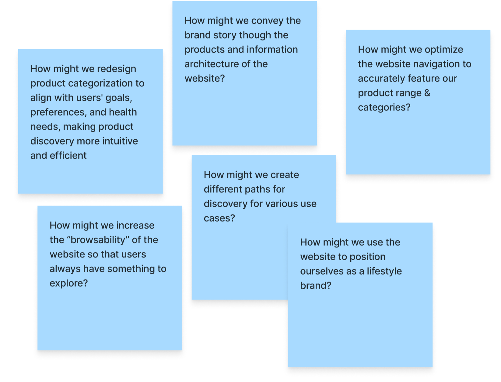
With our research in place we had a roadmap to guide us into the next phase of the project. We identified the following opportunities for product and brand discovery —
Discovery
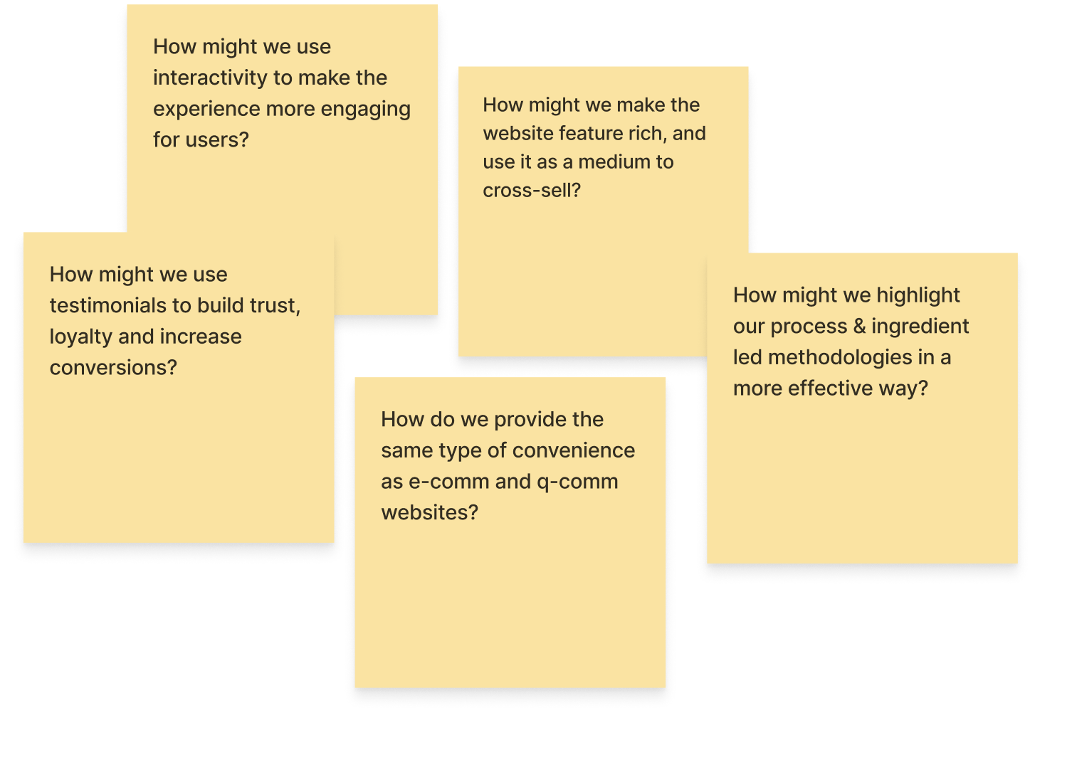
Engagement
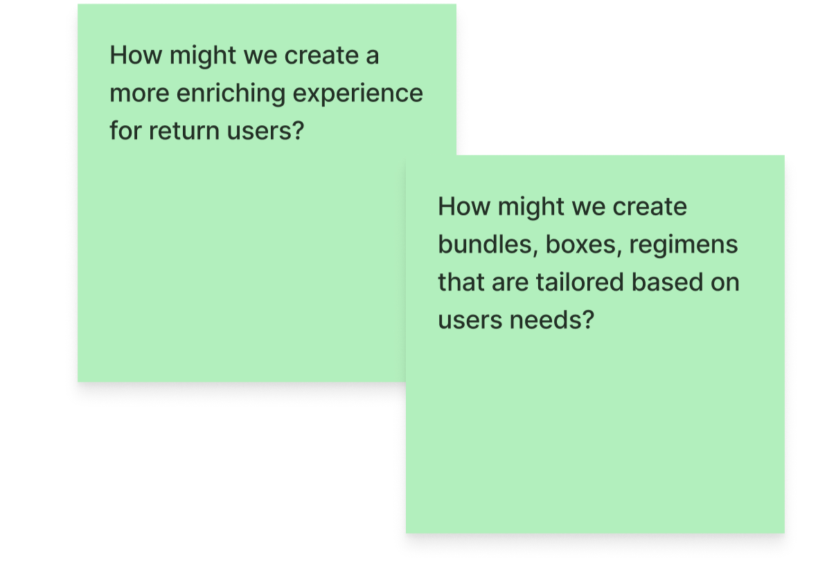
Customization
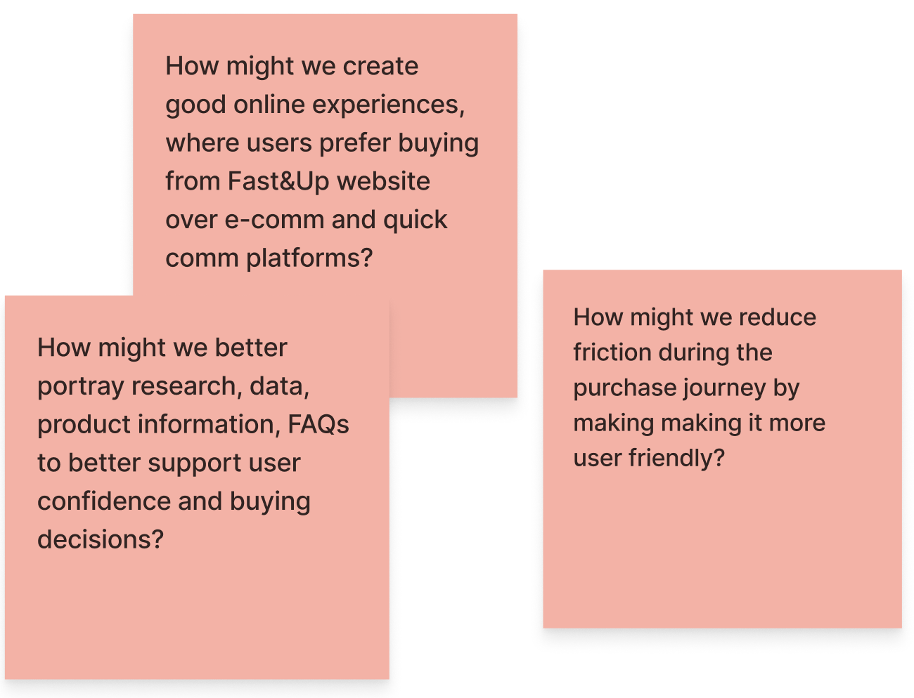
Experience
Developing wireframes
for key interventions
01 —
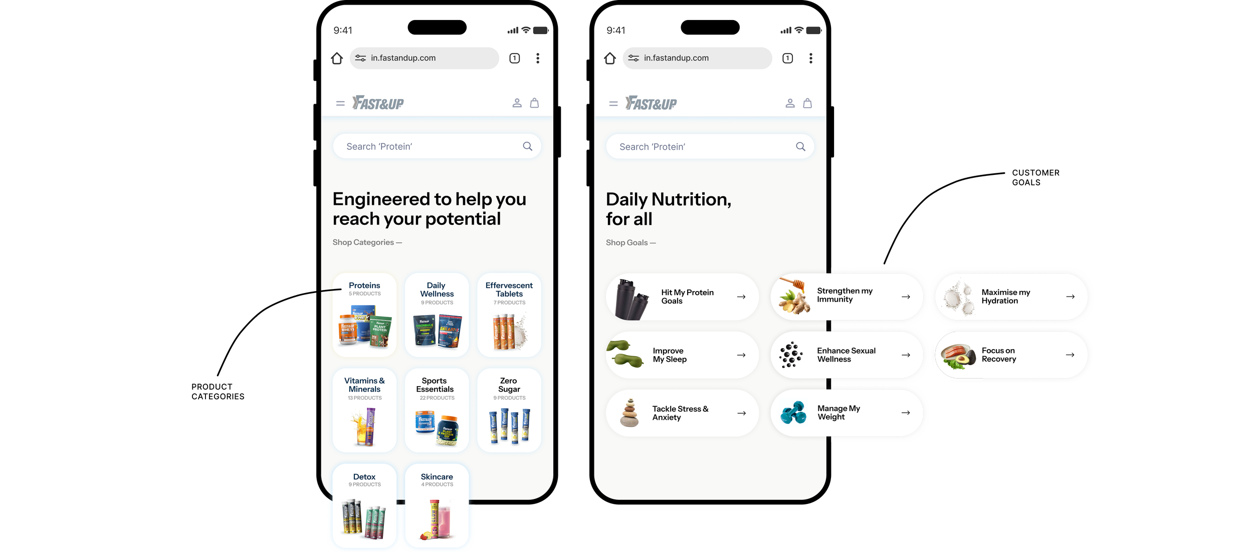
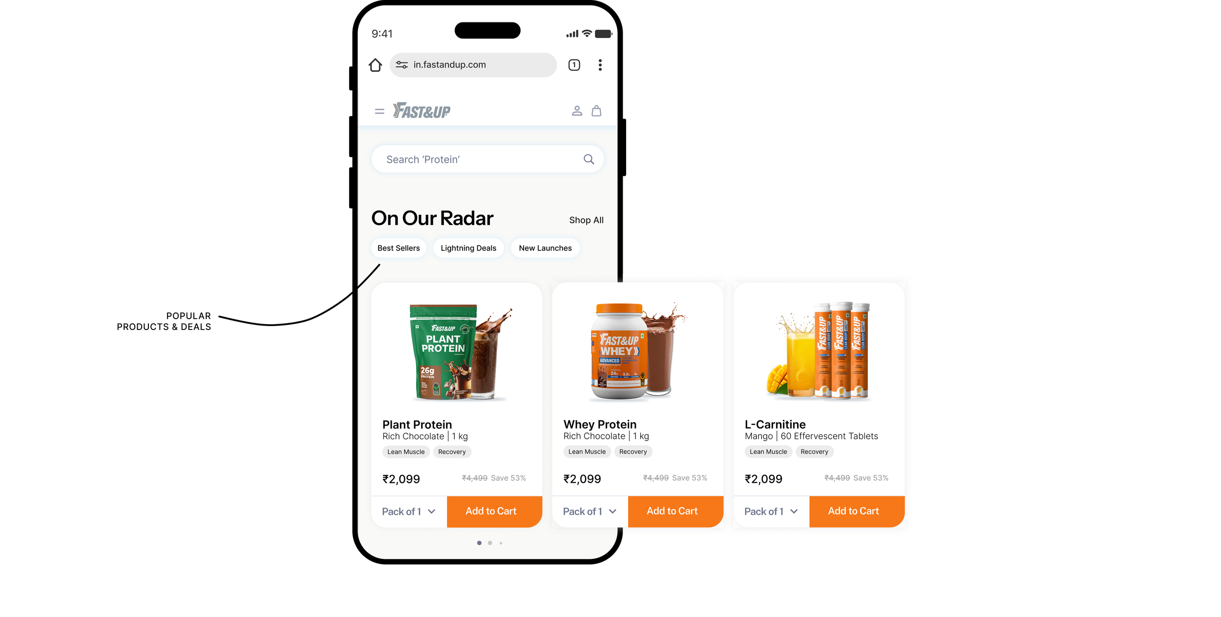
Improving discovery & building a better product hierarchy
02 —
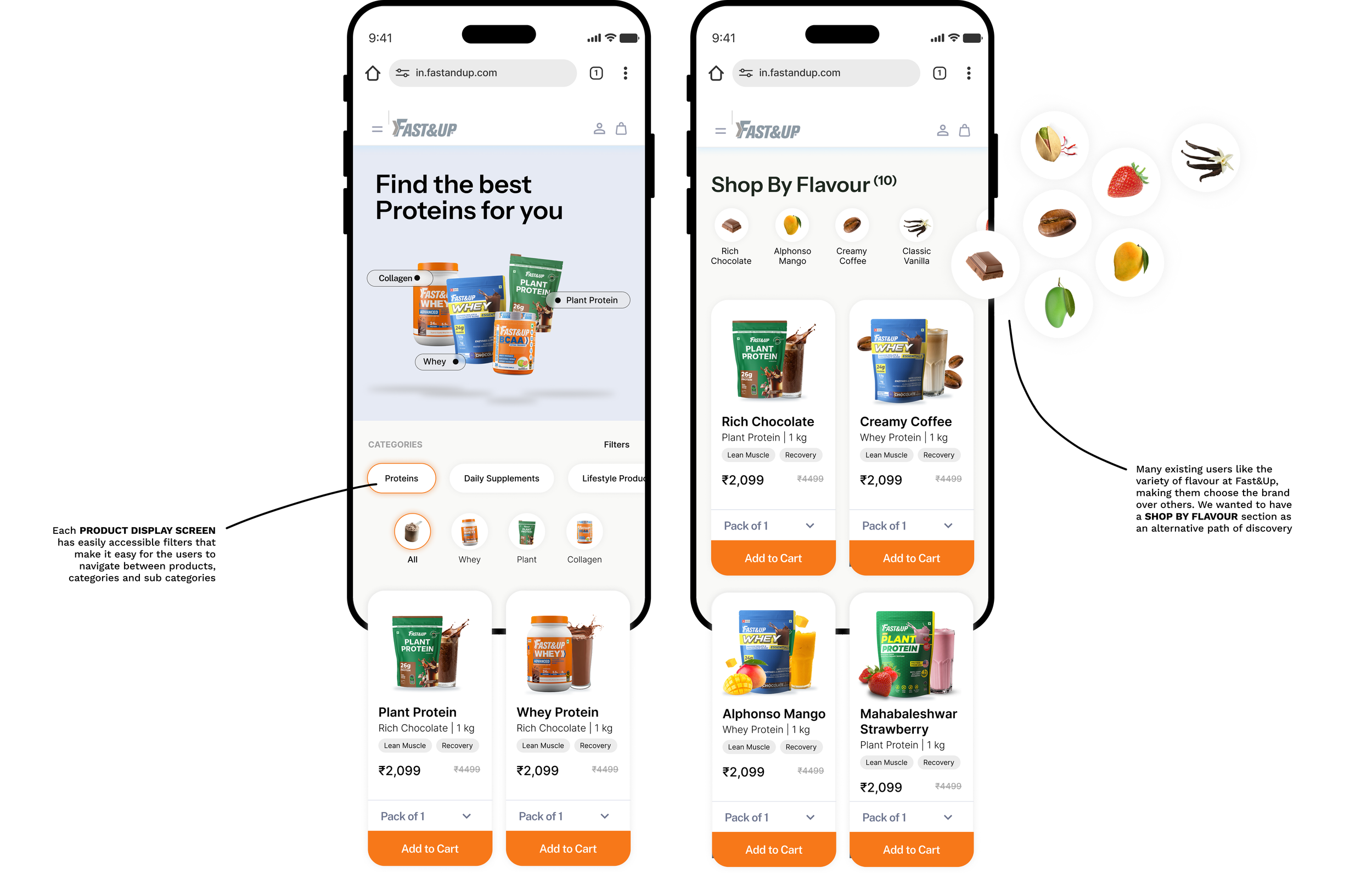
Robust filtration & navigation system for intuitive browsing
03 —
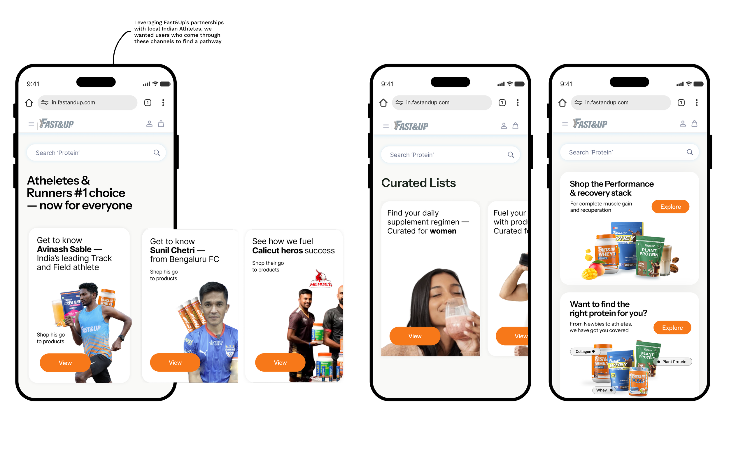
Guided shopping experiences and curated lists for alternate paths of discovery
04 —
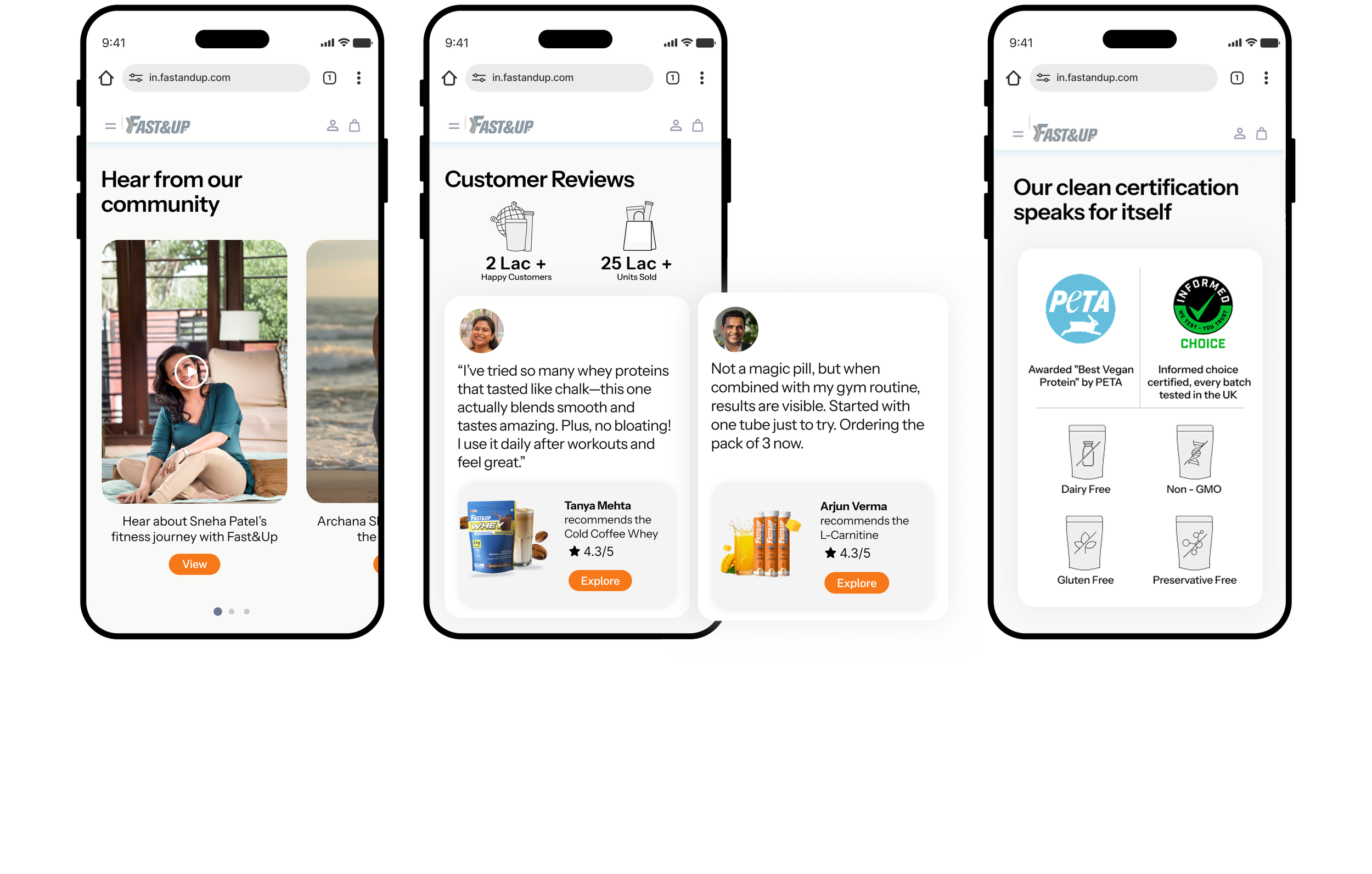
Leveraging trust signals via testimonials, certifications, return policies, real customer use cases
05 —
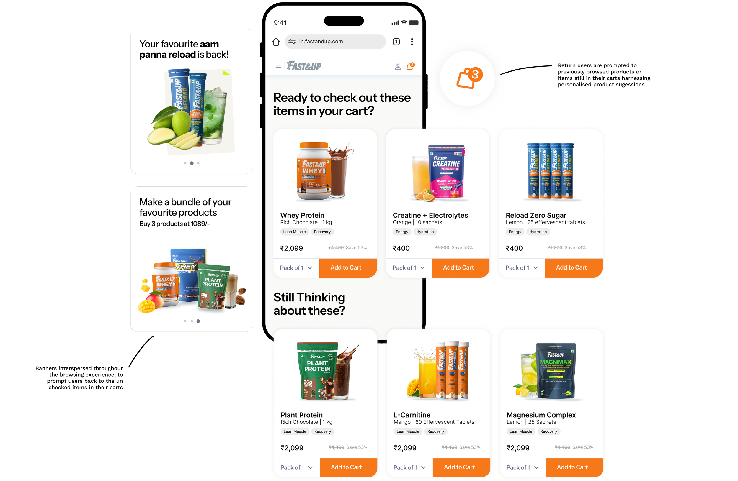
Using purchase history to power personalised product suggestions for return users
06 —
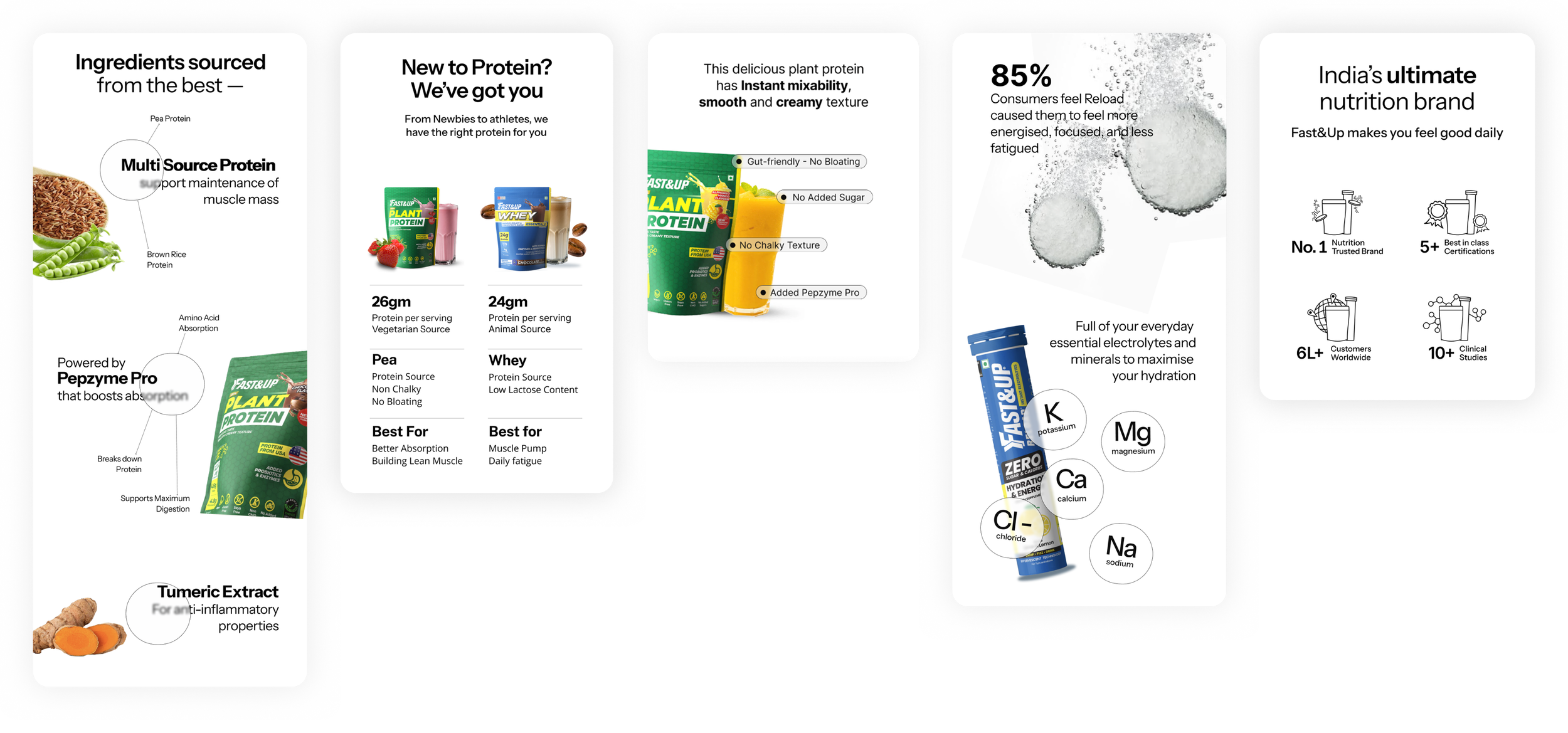
Embedding science backed insights into product pages for added clarity
Landing Screen
Product Listing Screen
Product Display Screen
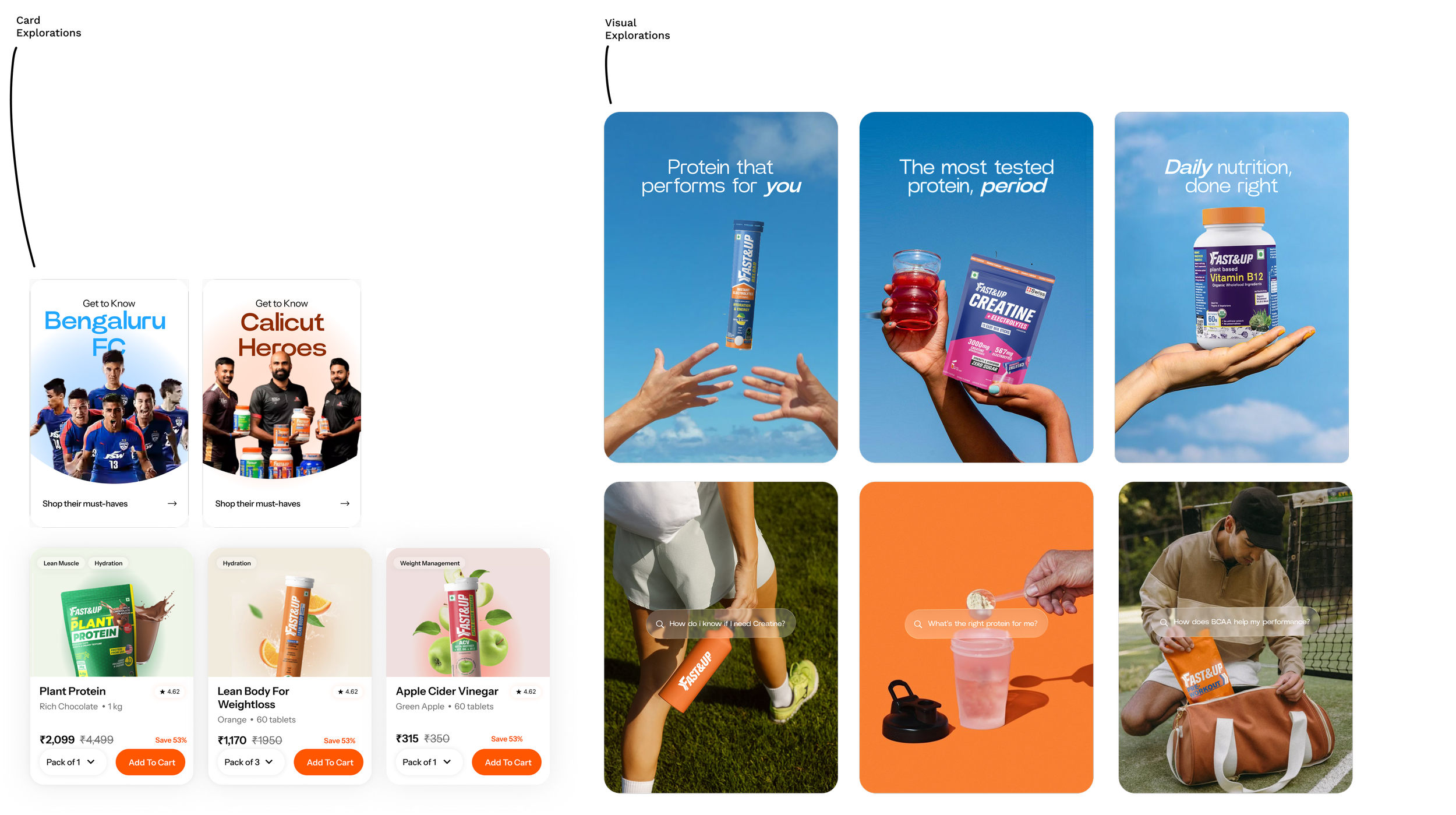
Graphic
Explorations

This project was done in collaboration
with the team at NowForm.
As the lead designer, my role was to build strategy, conduct research and develop high fidelity wireframes that could be translated into functional screens.