
Research for Decim.l, an app that helps young people invest
Client — Decim.l
Research, Strategy, User Experience
2020
Decim.l is a fin-tech app that aims to make investing easy, accessible and effortless for young Indians by using round up investing.
With this we wanted to take the guess work out of investing by making it less of a chore and more of an automated process, centring users everyday sundry expenses.
The app lets you set goals and earn rewards, all while your money gets invested on your behalf.
Identifying the target demographic
We conducted extensive surveys and interviews with over 200 people and gathered data about their financial journeys

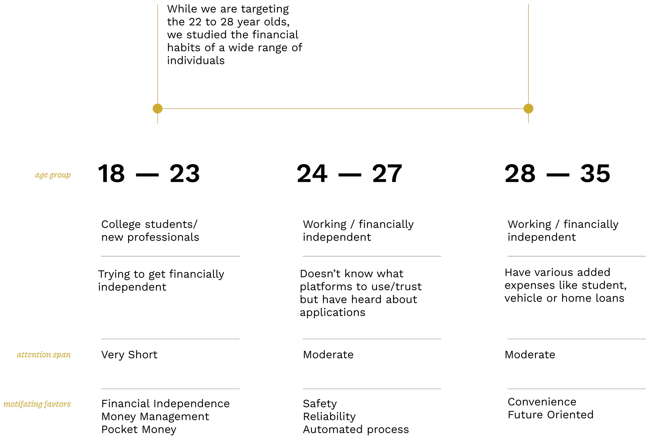
Here are some key insights that helped us understand the people we were designing for and come up with relevant strategy to further develop the decim.l experience —
While 95% of the demographic saves their money, only 65% actually invest it, out of which only half invest REGULARLY
01
On an average 30 to 40% of the salary is saved and about ₹3500 to 4000 are spent on sundry expenses like buying a coffee or using uber per week
02
Mobile apps are not the most trusted instrument when it comes to investing. SIPs are the most common among this age group
03
We asked our participants what they expect from decim.l —
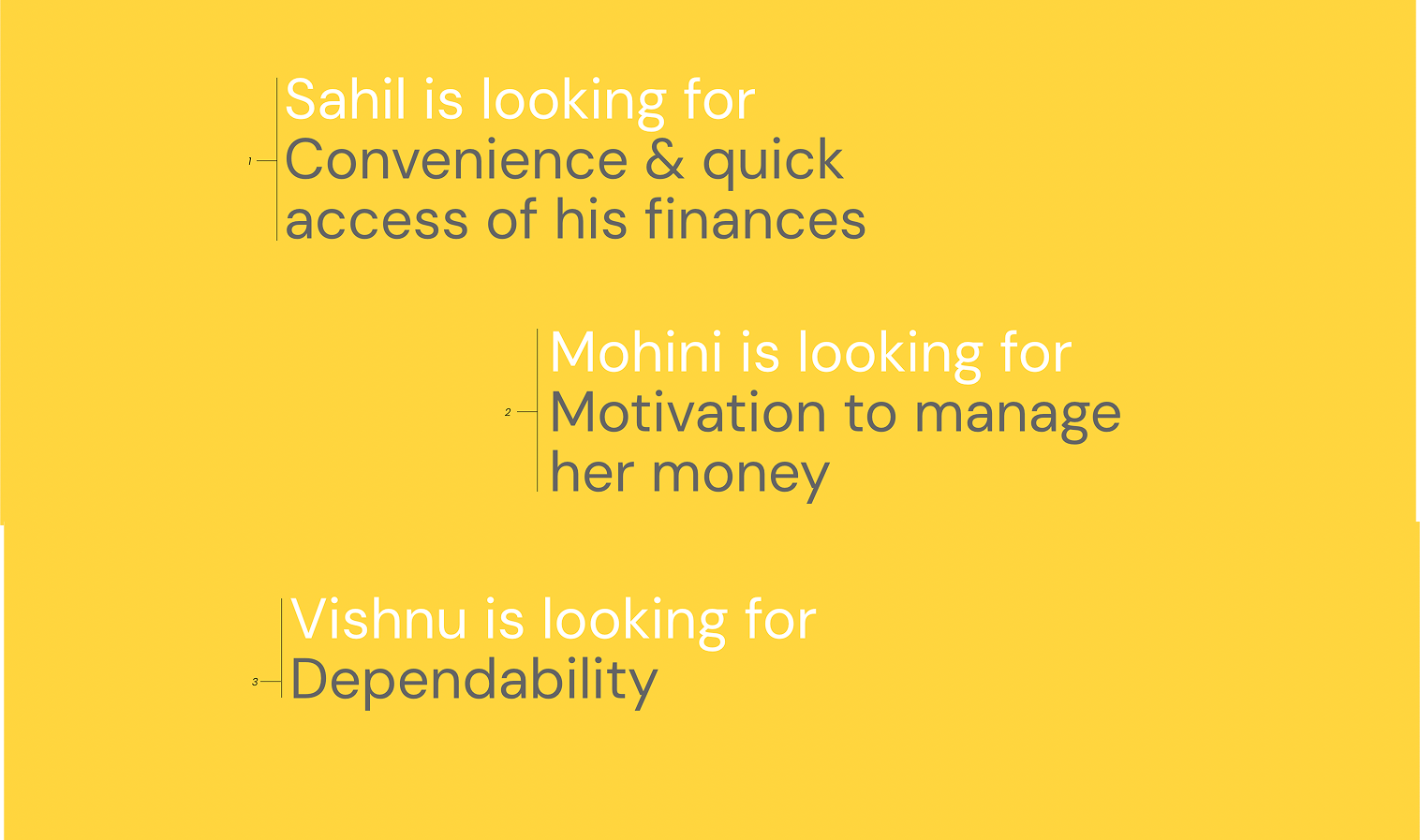
Talking to our demographic and gaining insights from them, revealed both excitement and cautious skepticism around financial apps.
Moving forward, we learned that we’d need to prioritise transparency, clarity & trust.
Streamlining the onboarding process
Developing a strategy for onboarding posed certain challenges as it included various steps that required users to go through financial verification. We wanted to create a seamless experience where users felt comfortable sharing their sensitive credentials.
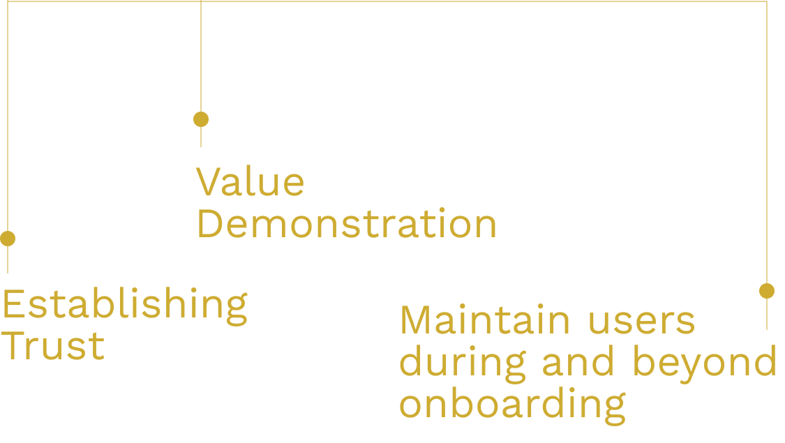
We prioritised
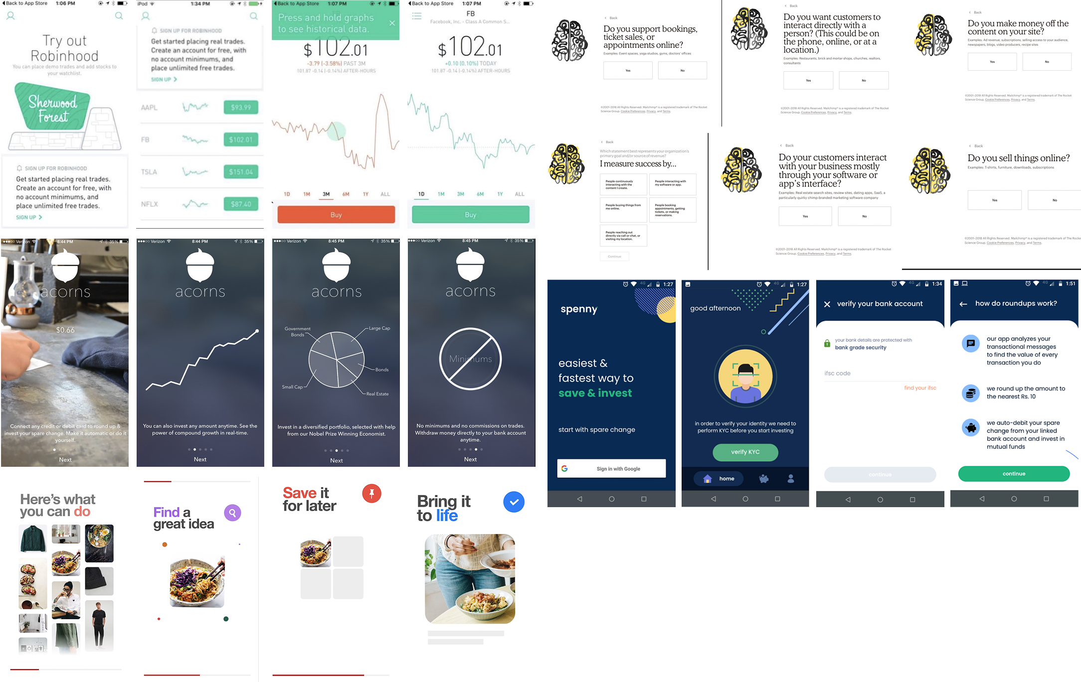
We looked at the onboarding process and strategies for various apps
→ Minimise total screens
→ Use of popups
→ Explainer gifs
→ Virtual tour
→ Do a “practice” transaction
→ Clickable demo
To make the onboarding seem less daunting for the user, we split up the process —
part 1

Set up your credentials
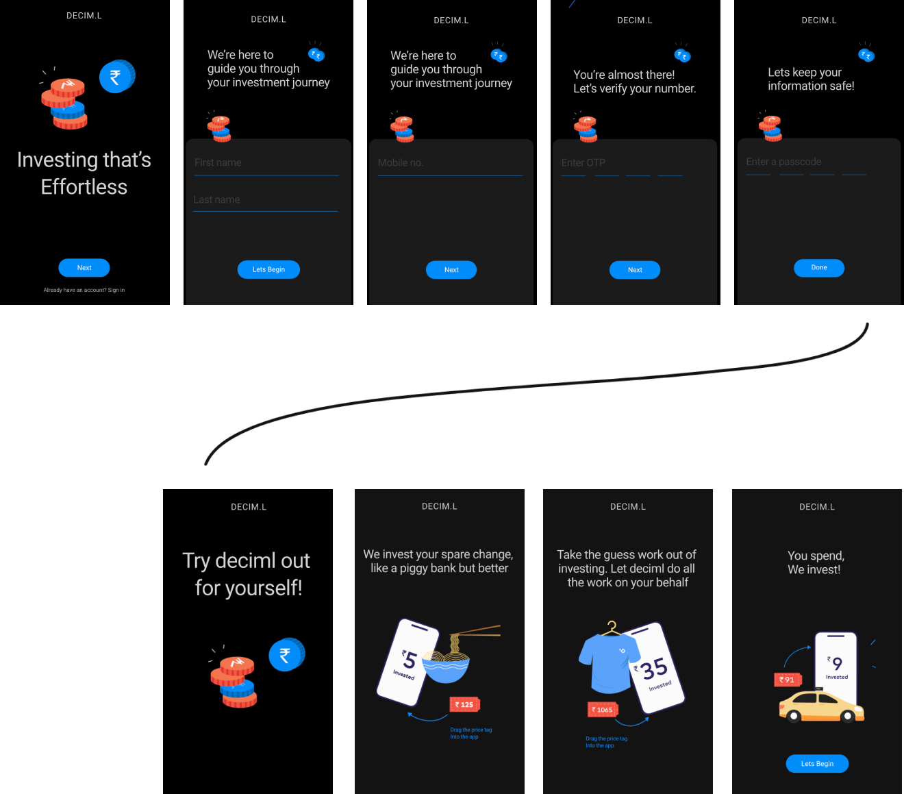
We decided to use a interactive/clickable gif where the user can do a "transaction" by clicking on the various items and see how the system of round up actually works

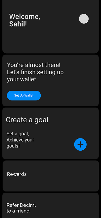
Dashboard
Taking the user to the dashboard shows them what they have in store and incentivizing them to set a goal and link their bank accounts
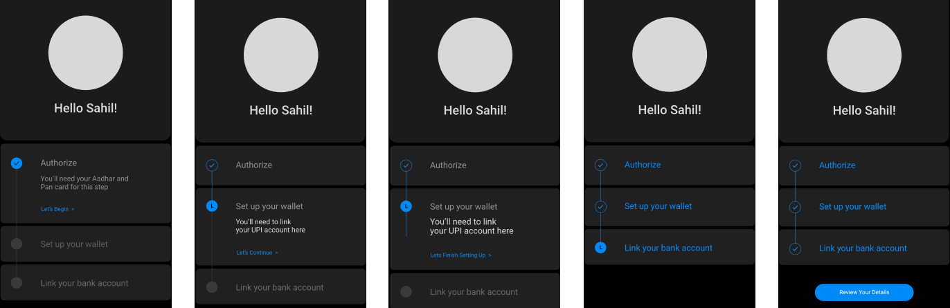
Set up KYC while exploring the app and the other features
part 2
A simple progress bar shows the user how many more steps they have to go.
Users can pause/take a break and go back to dashboard to further explore the app and set goals
We figured that giving a user space
to complete the onboarding in stages made it a more palatable process.
We were able to strike the right balance between having a friendly tone of voice along with concise guidance through the more challenging steps and further translating that into the app
Wireframing and building decim.l
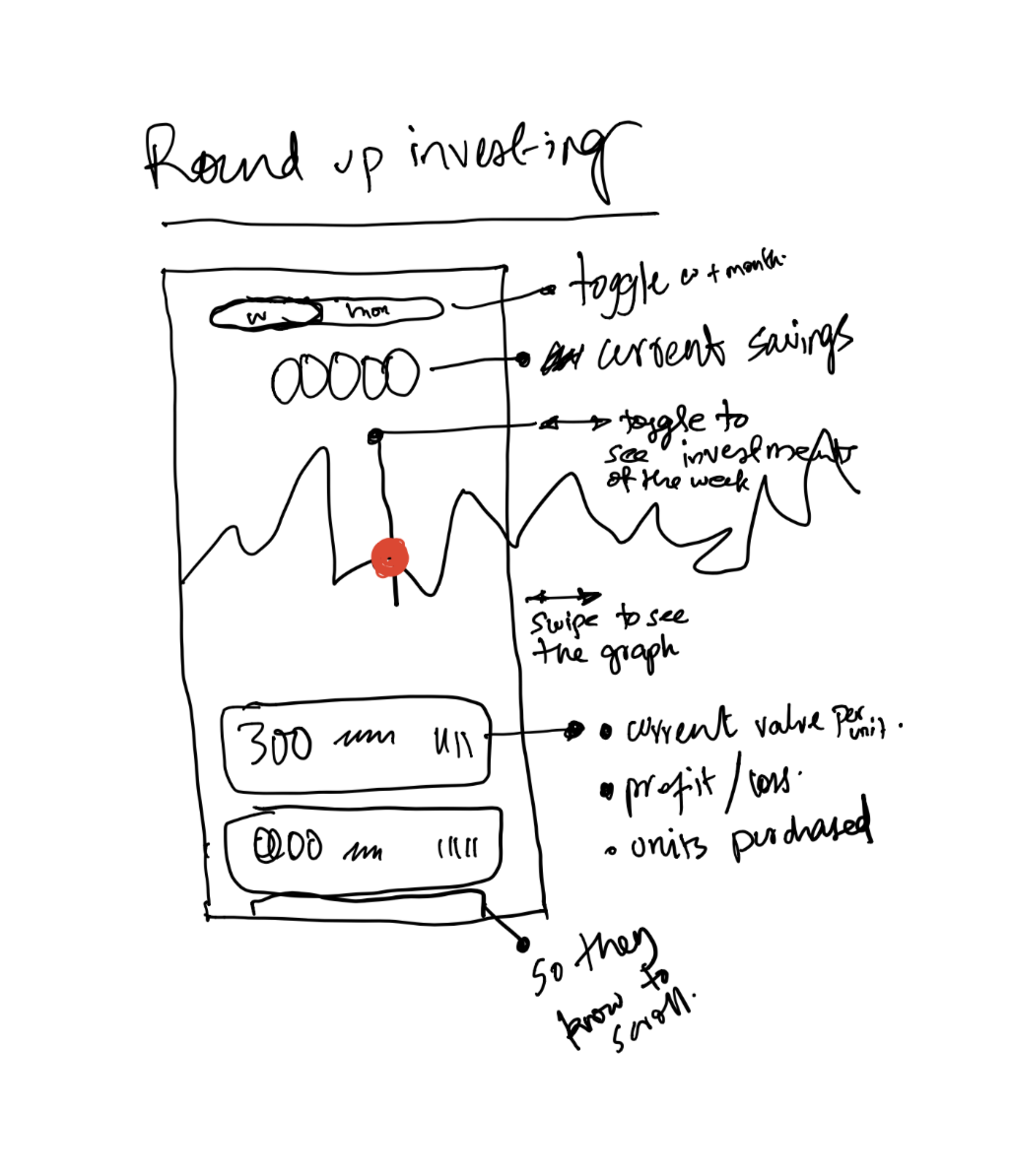
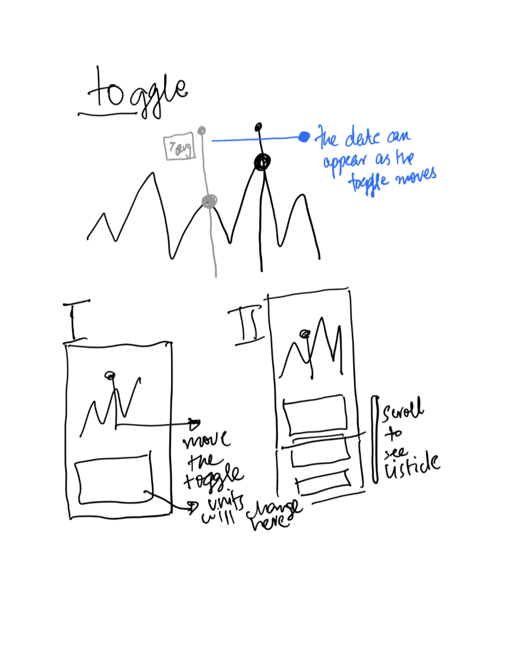
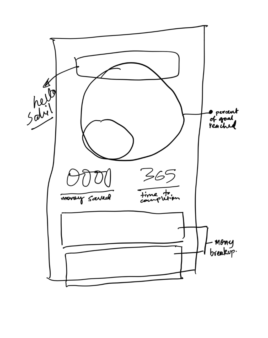
While developing the wireframes
we wanted to focus on
→ Visualizing various different types of financial data
→ Interactivity
→ Building engagement / incentivize with rewards
and referrals
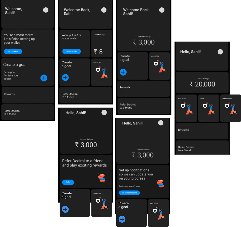
Dashboard
01
Round-up investing
02
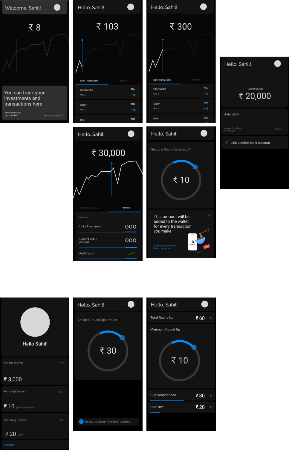
The user can succinctly view what the financial breakdown is for each transaction and edit the amounts as per their requirement
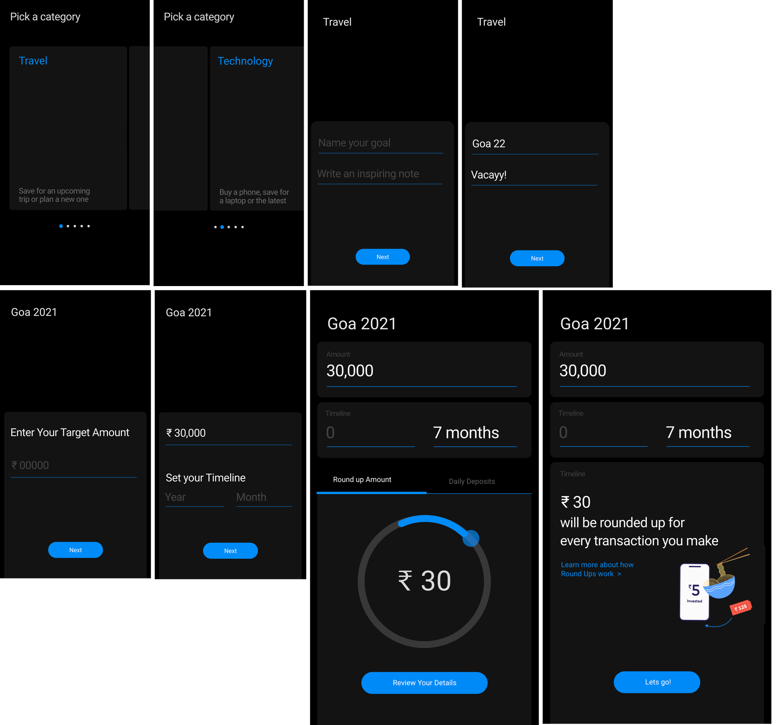
Goals
03
The Round up amount is calculated based on the users spending patterns. If the user edits a paramter, the round up amount adjusts accordingly
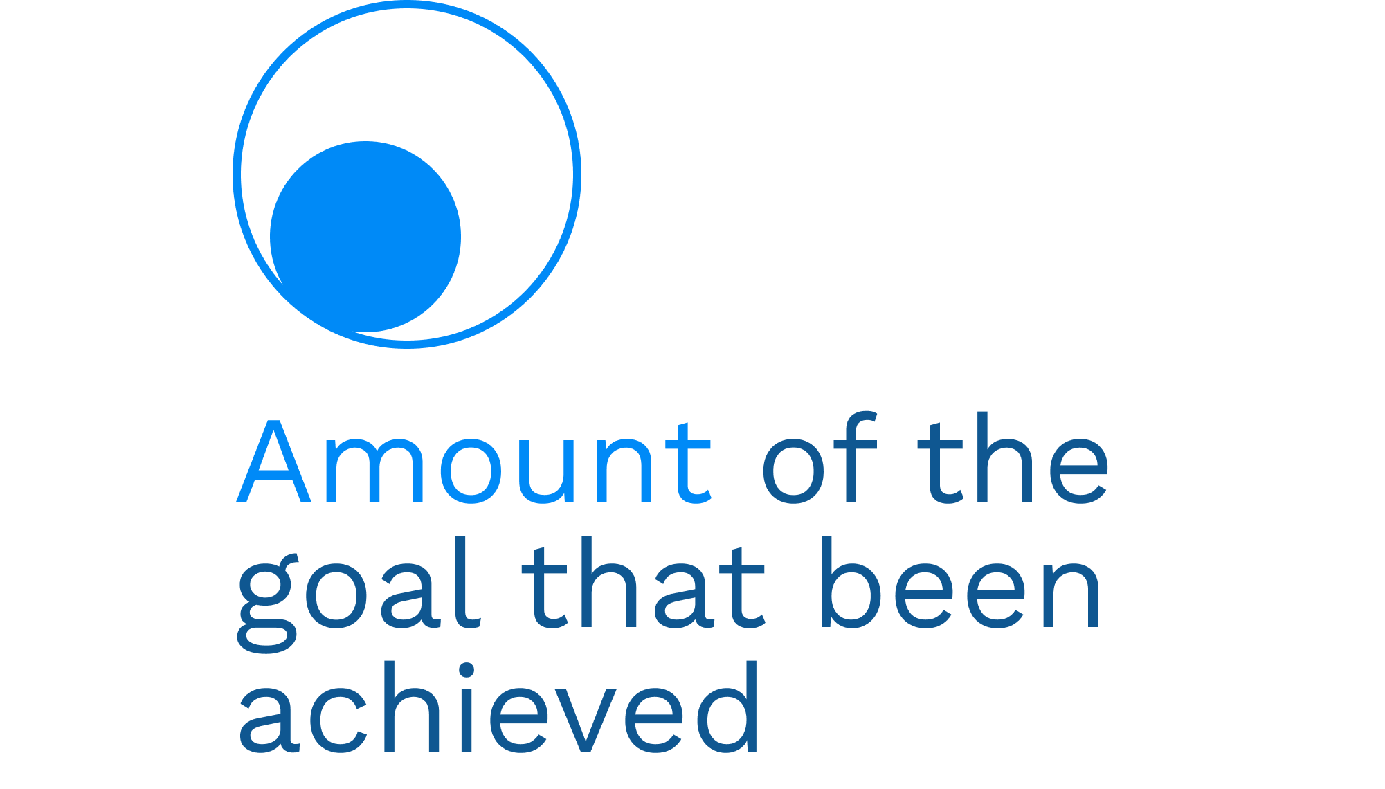
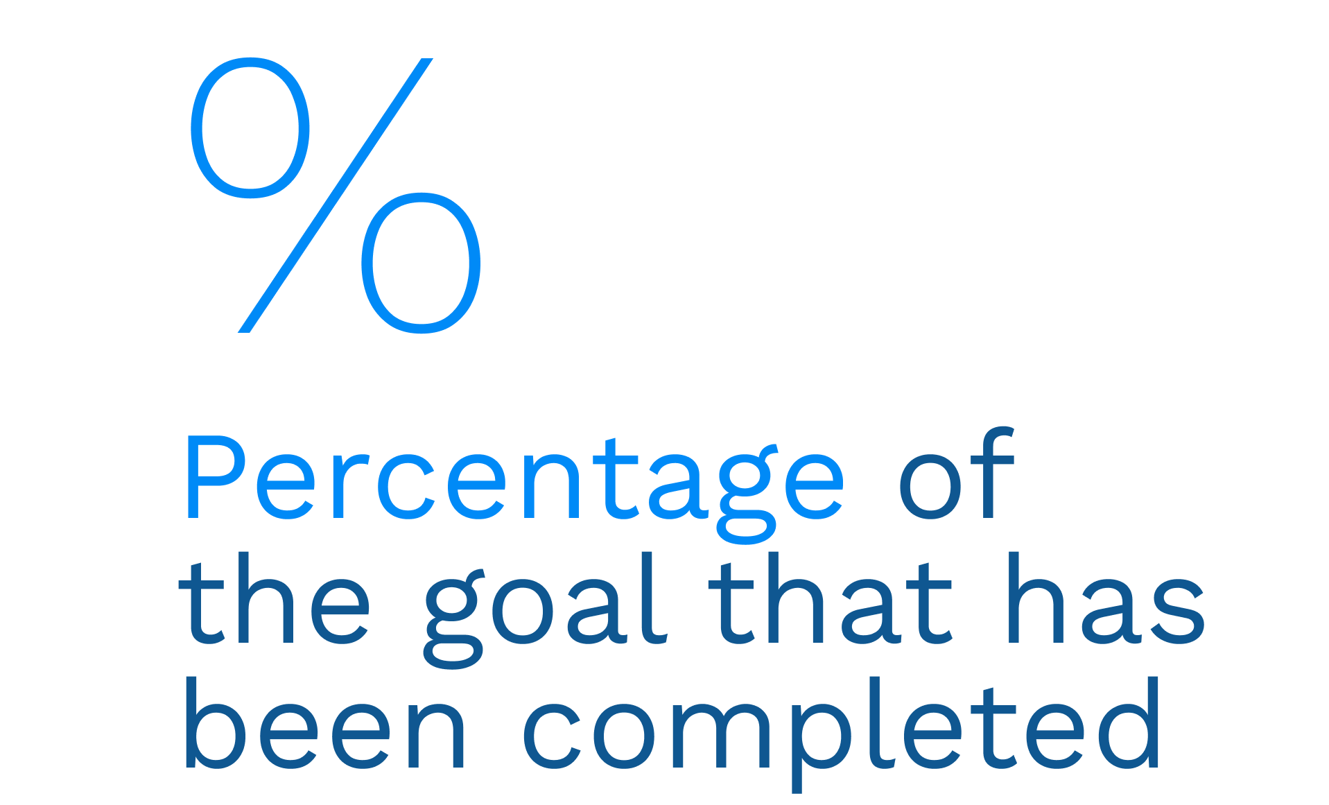
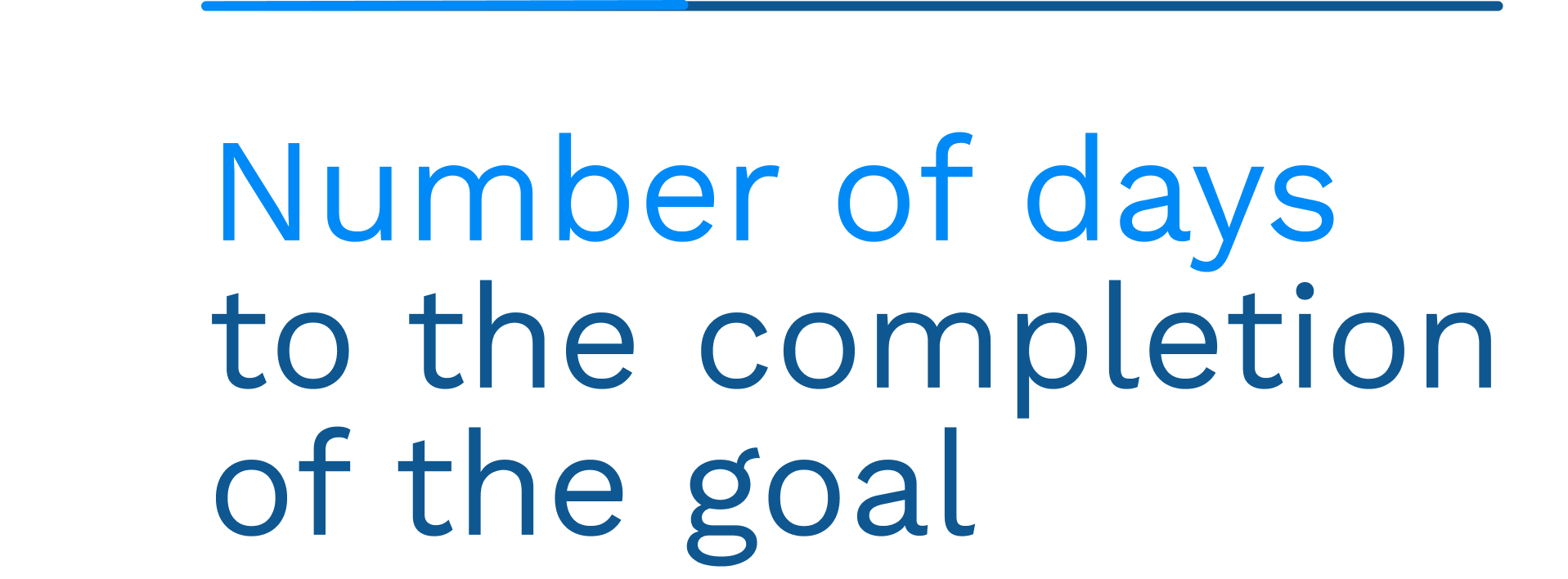
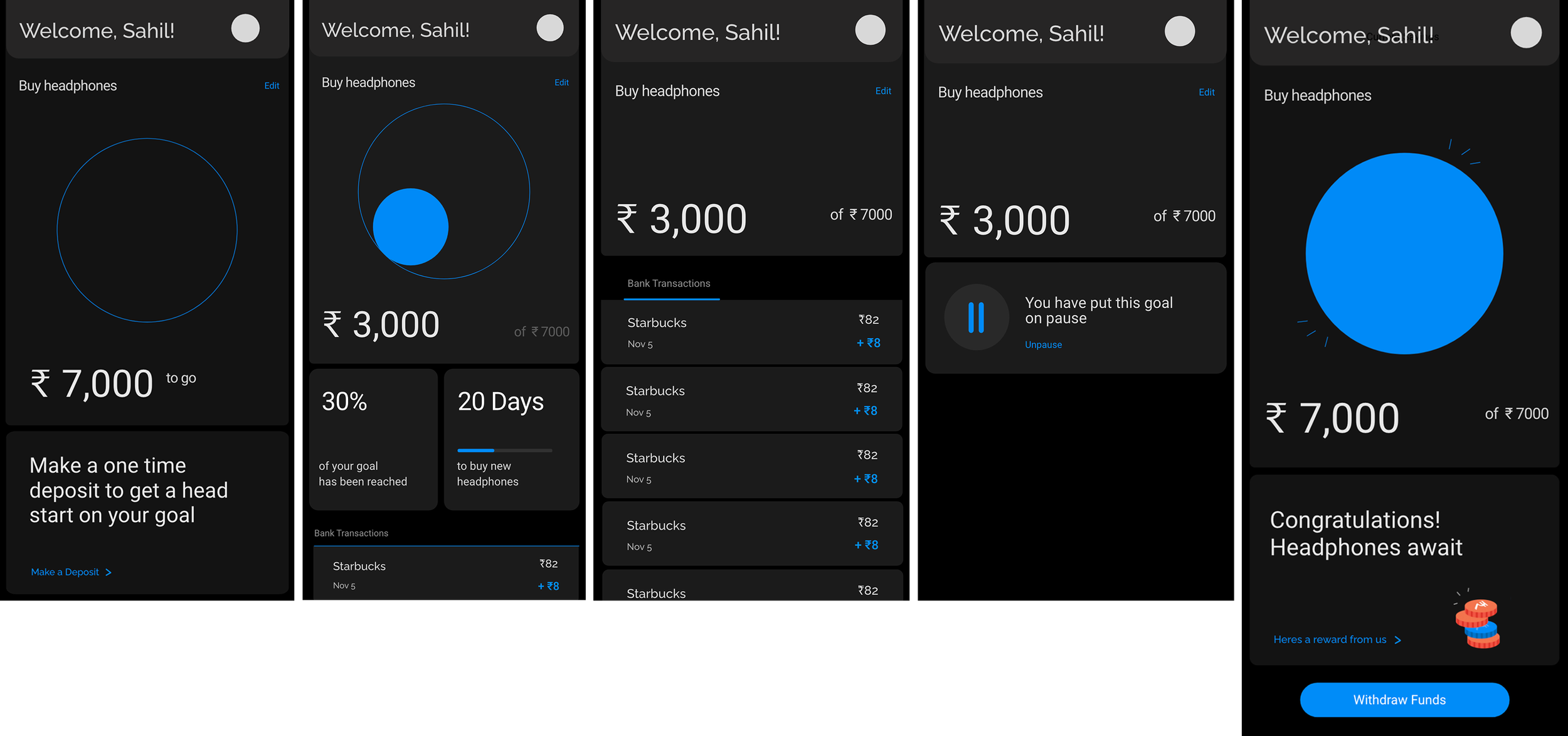
With the goal dashboard we wanted to show 3 key parameters

Developed in collaboration with
Out and Out Design
for Decim.l. My role was to lead research and develop high fidelity wireframes and data visualisations