
Mapping queer politics for PinkList India
Client — PinkList India
UX, UI, Data Visualization, Visual Language
2023
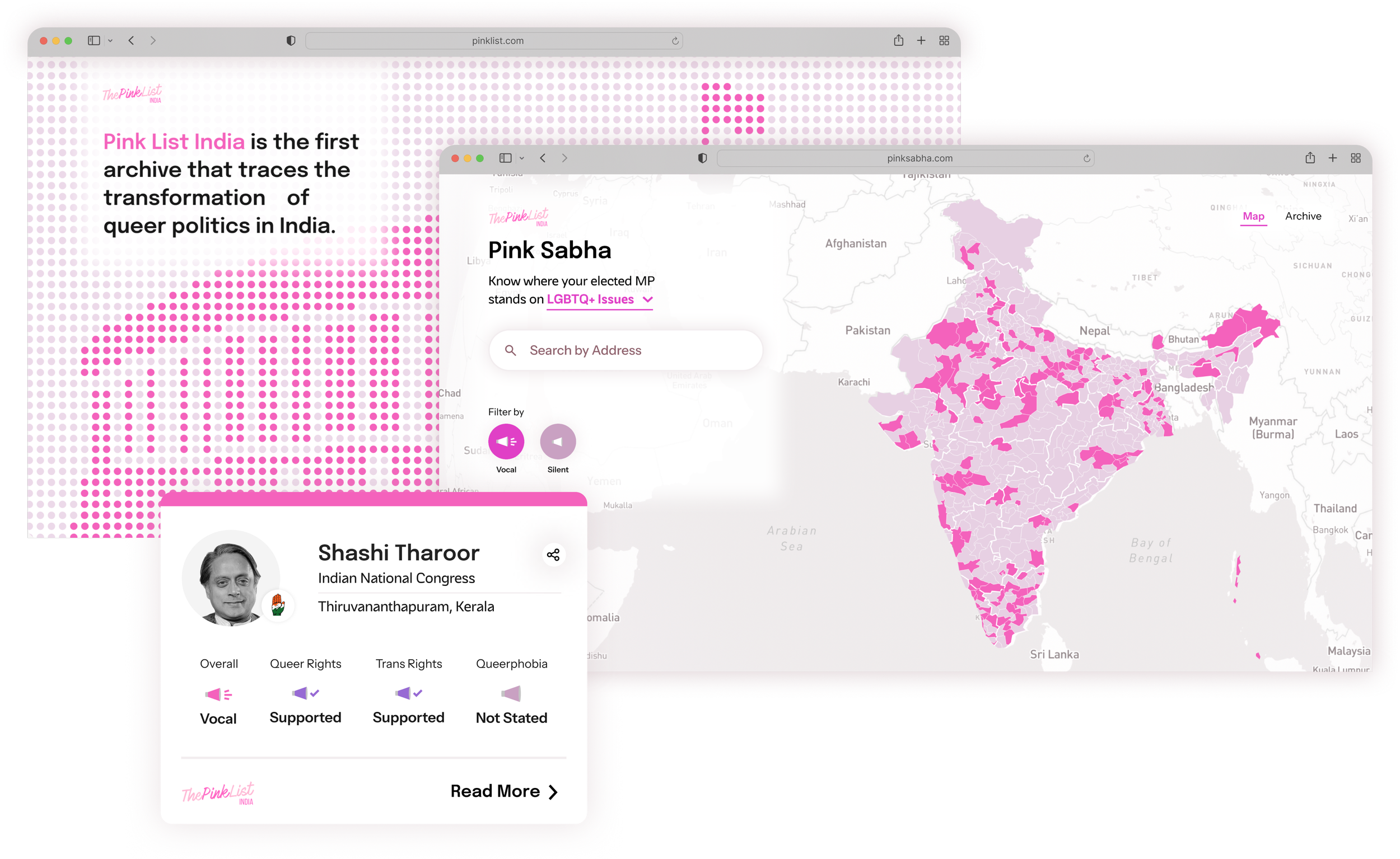
Pink List India is an archive that traces the transformation of queer politics in India, where users can look up their respective MPs and their stance on LGBTQIA issues. It aims to serve as both, a research platform and a tool for young voters to make informed choices.
The Scope
The challenge was to combine the PinkList India site with PinkSabha consisting of the Map screens and Archive screens, into one umbrella uniting the visuals and experience of both

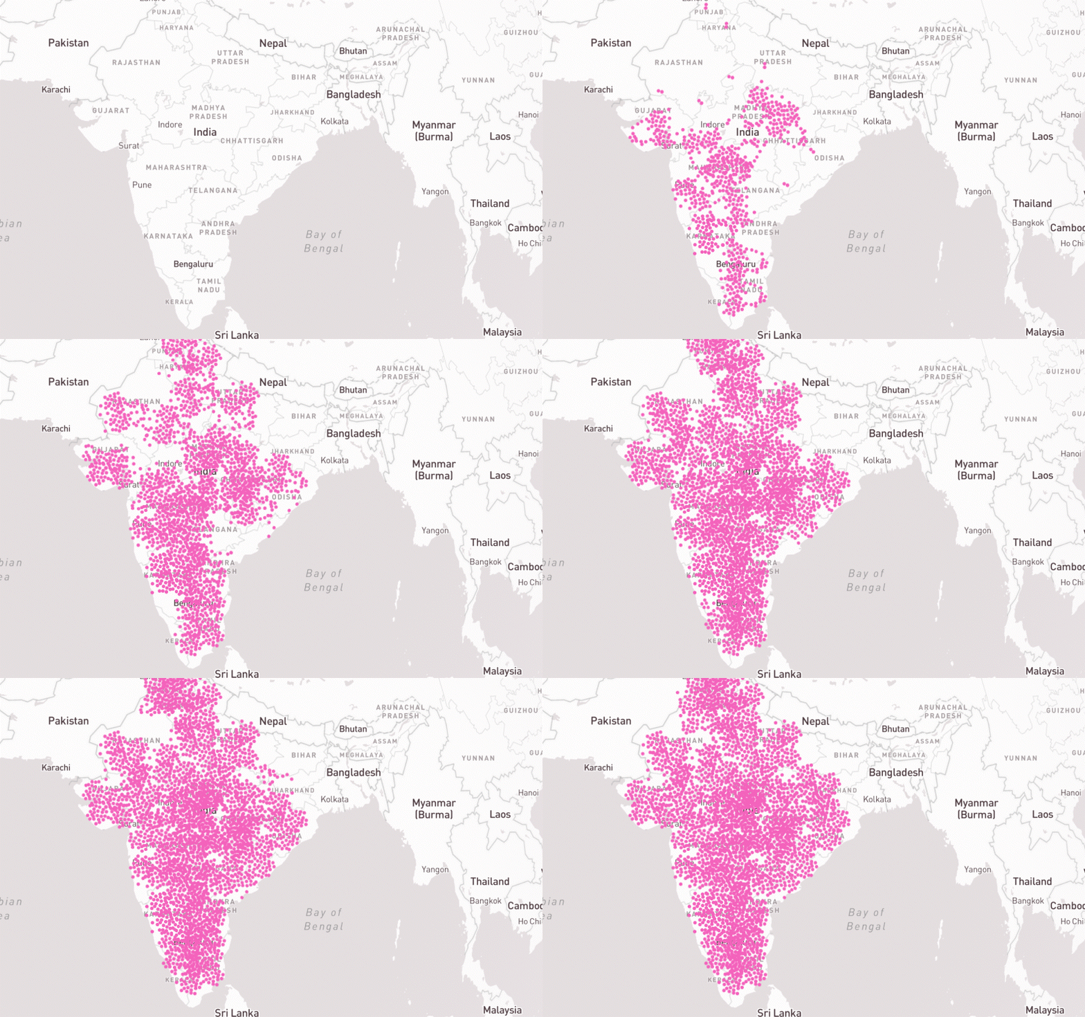
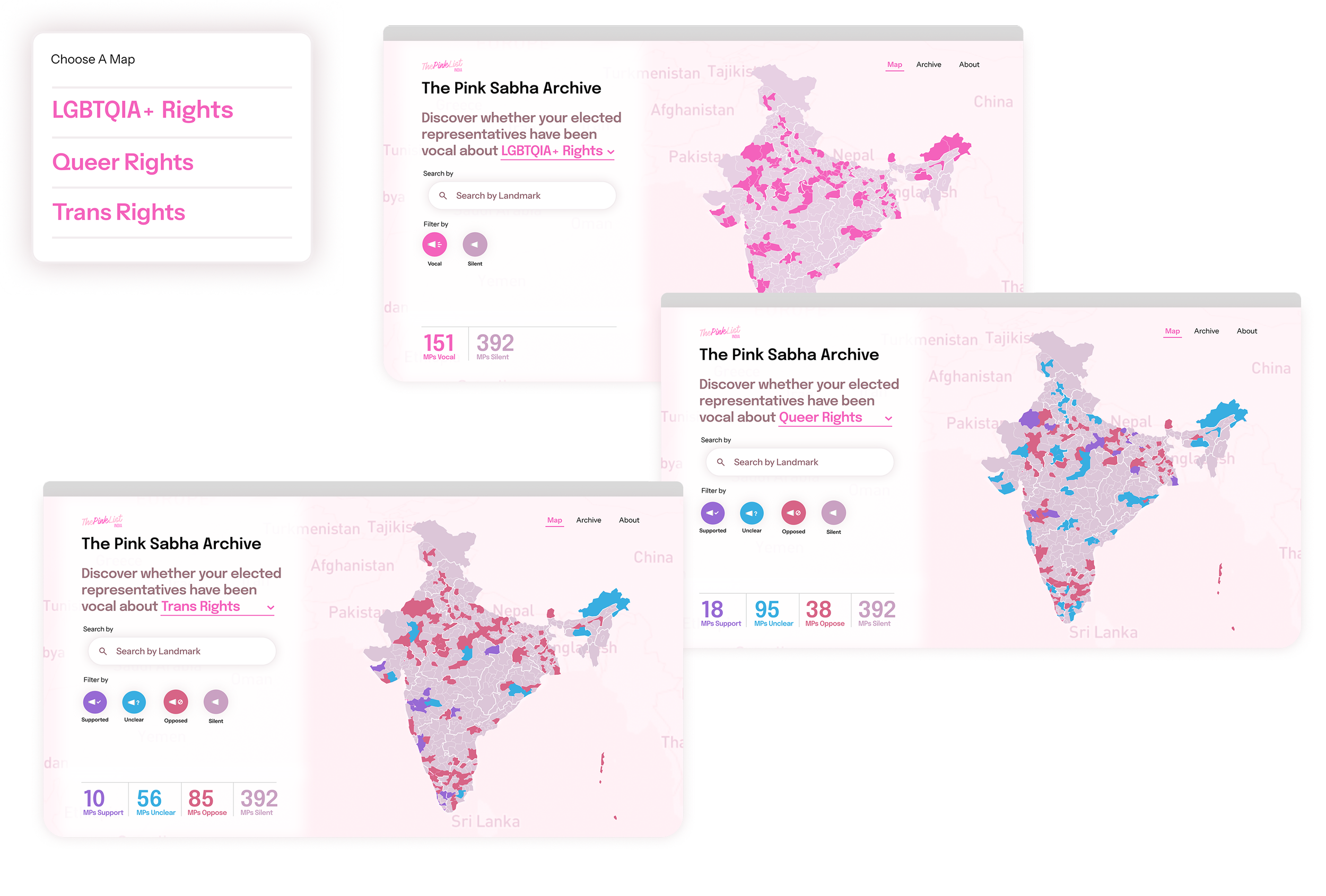
Building the interactive maps
PinkSabha traces and documents the political landscape and its stance on LGBTQ+ issues in India and publishes relevant and throughly researched information that is accessible to everyone from young voters to researchers.
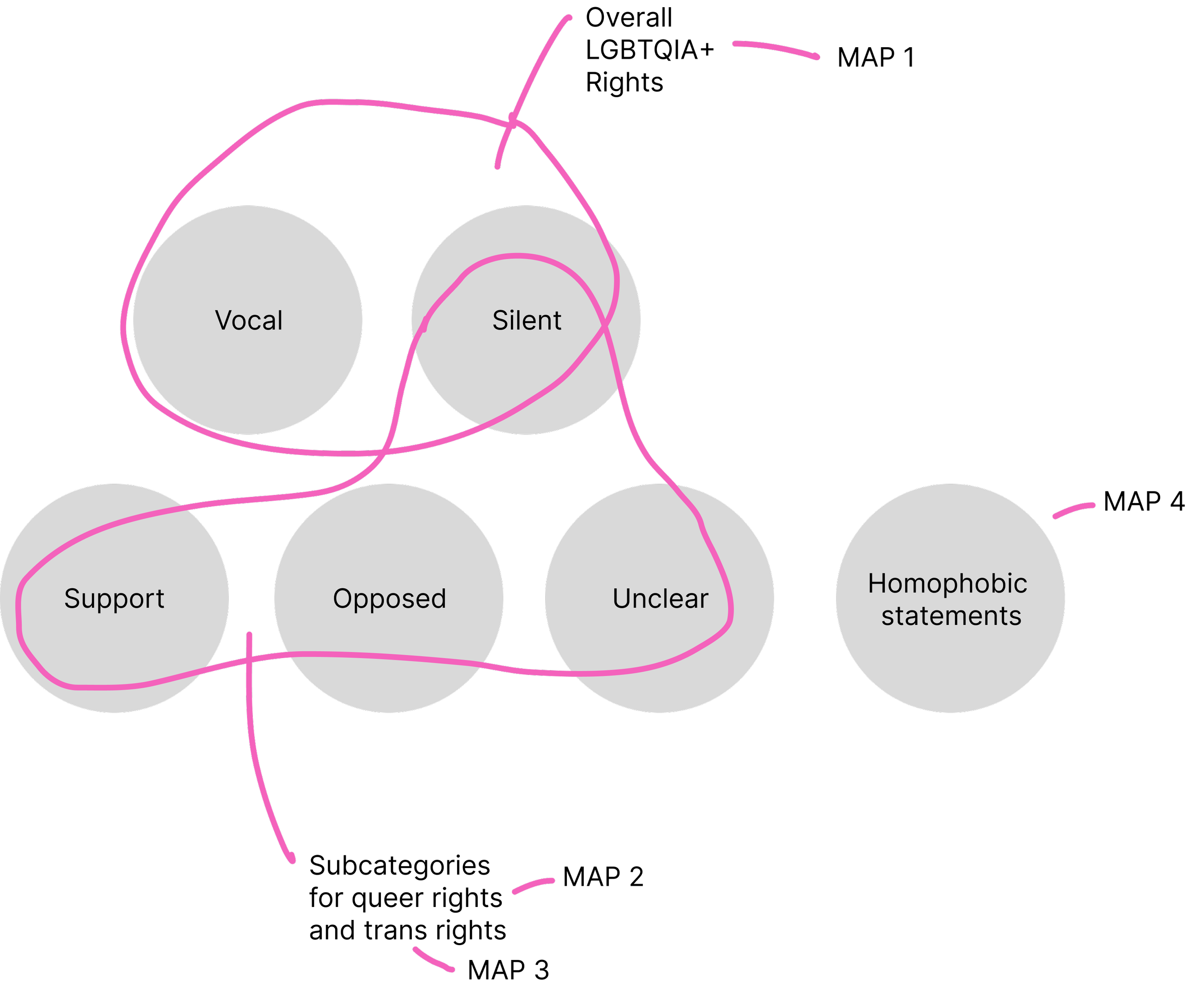
We started with enhancing the map experience and restructuring the information architecture by dividing the politician data into 6 categories and 4 maps — easily navigable by users.
Our primary challenge was to establish a system that would accommodate the varied types of statements made by political representatives — the maps depict the stance on LGBTQ+ rights, while the categories and subcategories depict the type of stance taken by politicians.
This information structure is based on how the LGBTQ+ community is viewed in India, where trans rights are often separate from overall LGBTQ+ rights. Thus a politician can support trans rights but oppose queer rights or vice versa.
Icon system
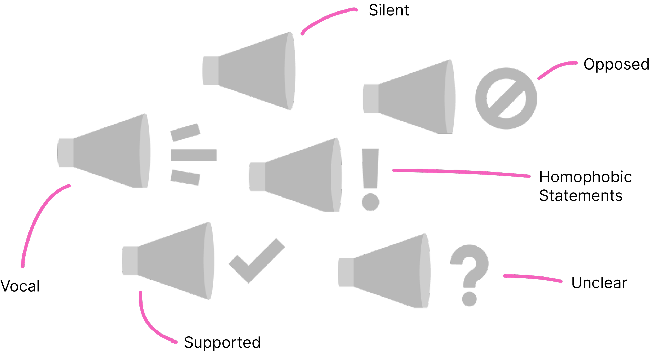
We build the custom set of icons for the categories, that could be used across maps to help with cohesiveness.
The icons use universally identifiable shapes that work with or without context. These icons ended up being used both in UI patterns and as graphic elements.
To have a fully functioning map system, we developed an adjoining colour system to work across maps and categories as well as a colour system for the overall visual language of PinkList.
Colour system

Archive Screens
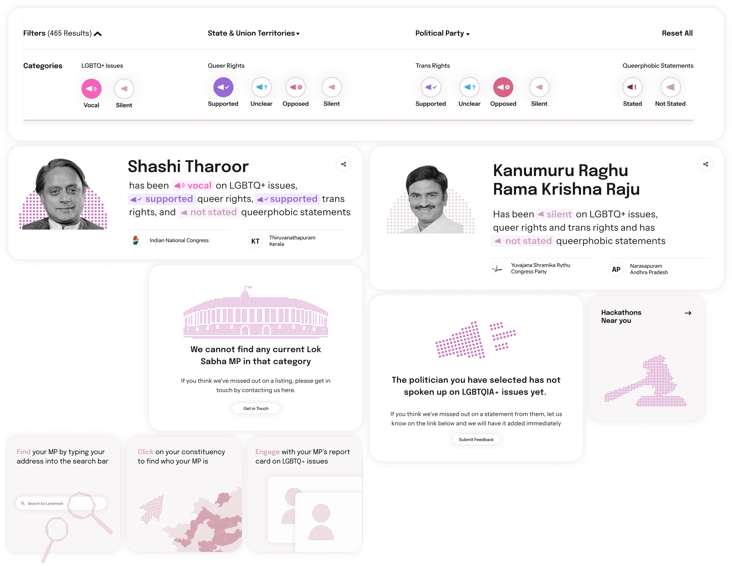
The Archive section takes the foundational elements developed for the maps and carries them forward. The icons become an important part of the filter, the map colour palette is supplemented with a neutral one and illustrations are added for context
Landing Screen

This project was done at NowForm, with Wamika Gera, Namita Sunil and Charu Pragya.
We also developed the Pinklist Report — highlighting the transformation of queer politics in India. Read more about it here — Pinklist Report